
Turu
Mobility service Branding
Mobility service Branding
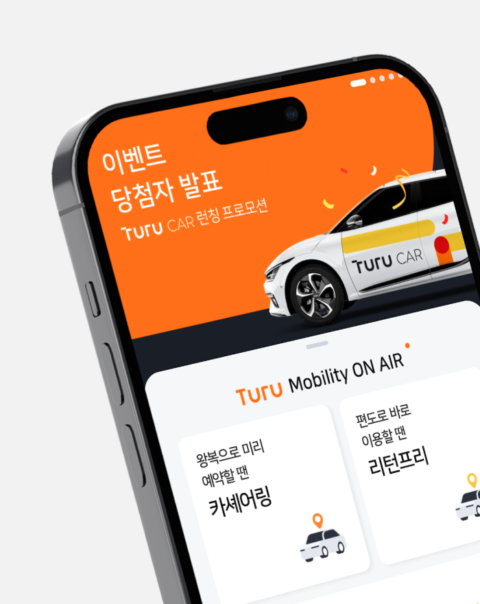
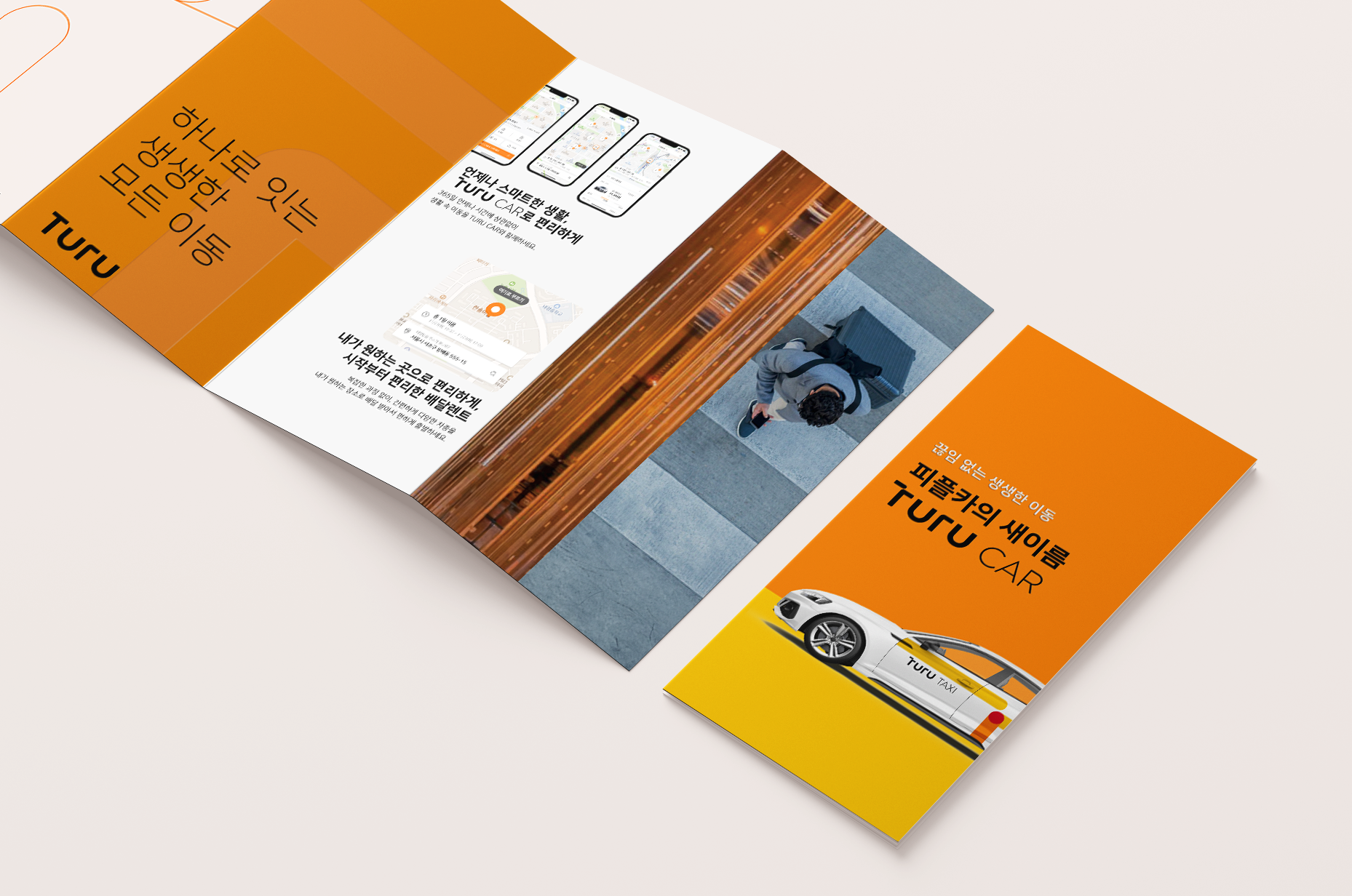
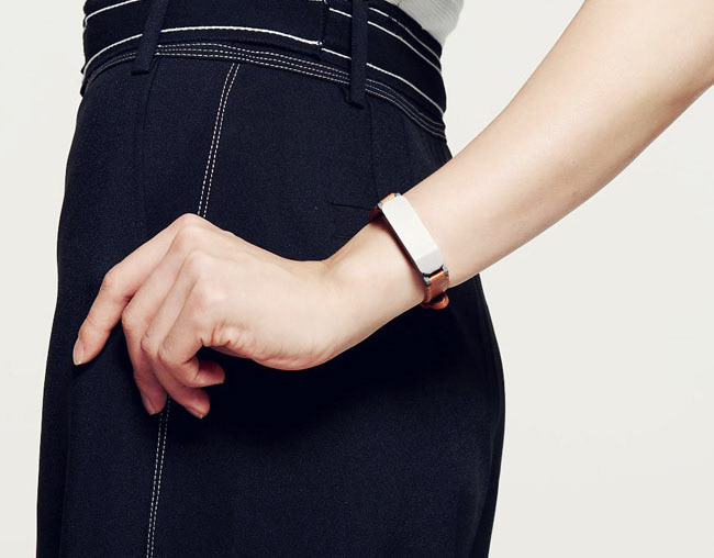
Studio Tangible has developed Brand Identity for TURU, a mobility service brand that aims to connect all the connections in our daily lives. We wanted to effectively express three elements in various applications: Line, representing connection of roads, Dot, which symbolizes a vivid mobility experience, and a combination of Line and Dot, which represent an integrated service platform.
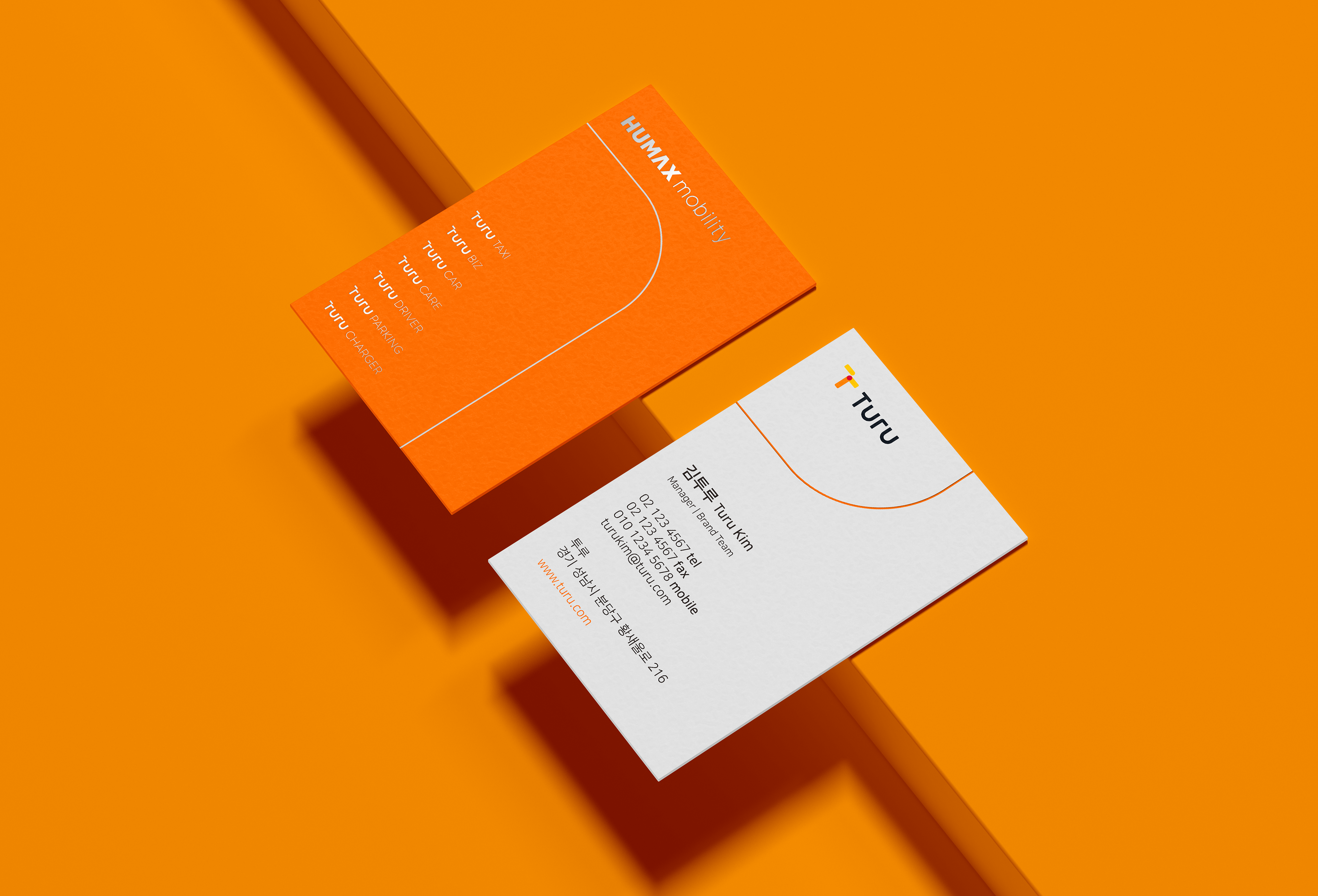
Studio Tangible consistently applied cropping method and magnification across design items. In addition, the combination of area graphic elements and delicate line elements was used alone to increase the flexibility of the design that enables an adaptation to diverse applications.
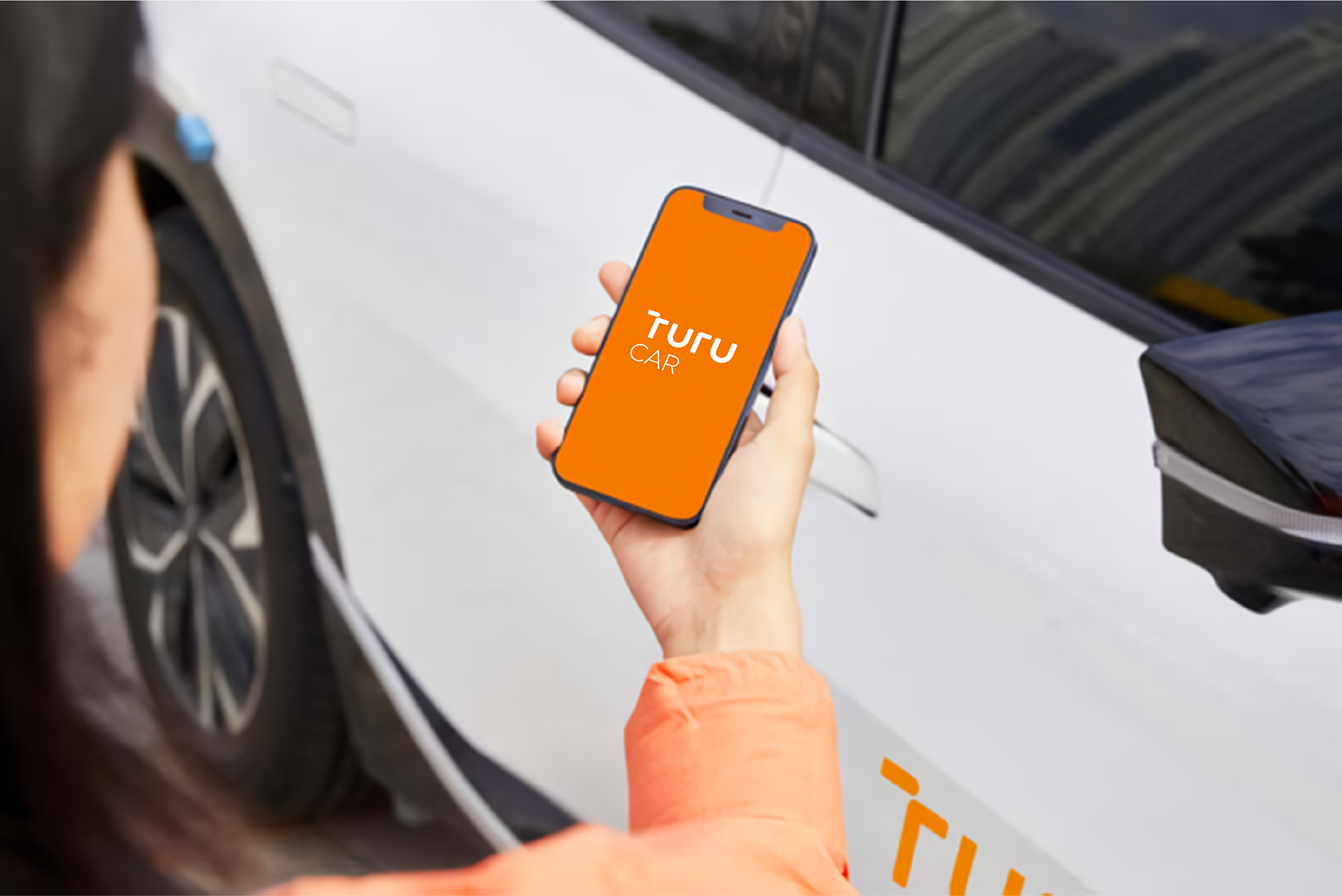
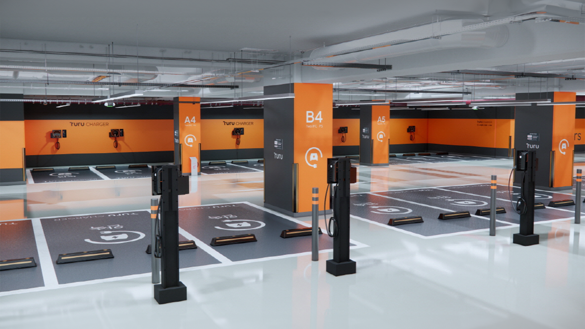
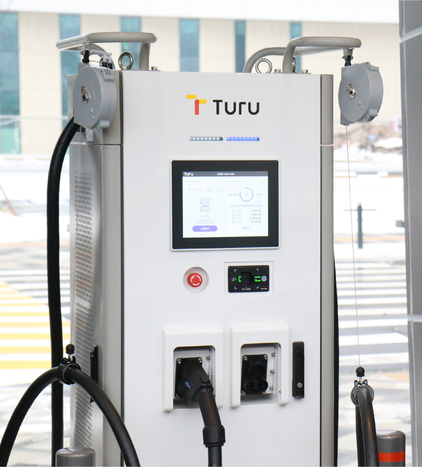
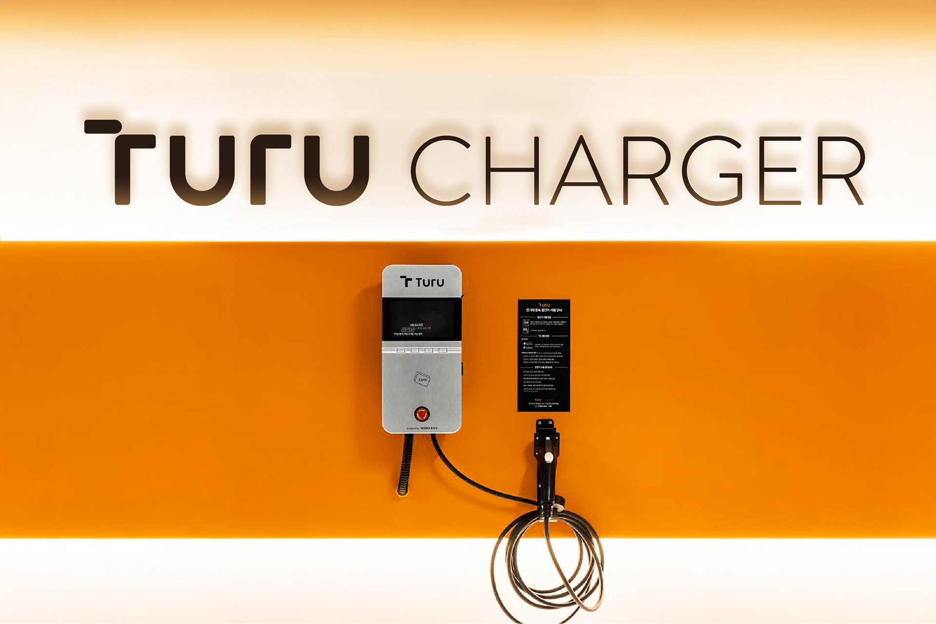
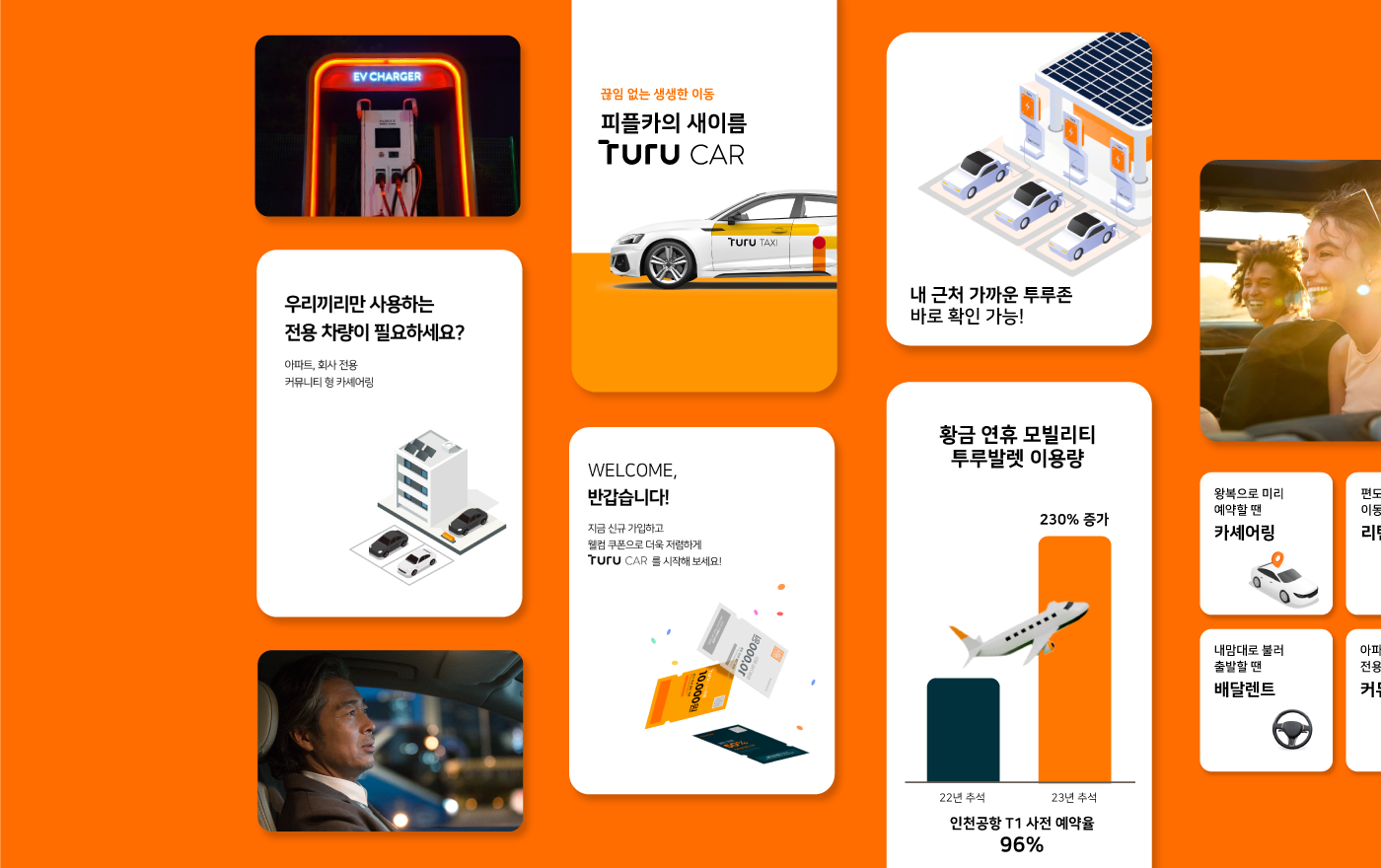
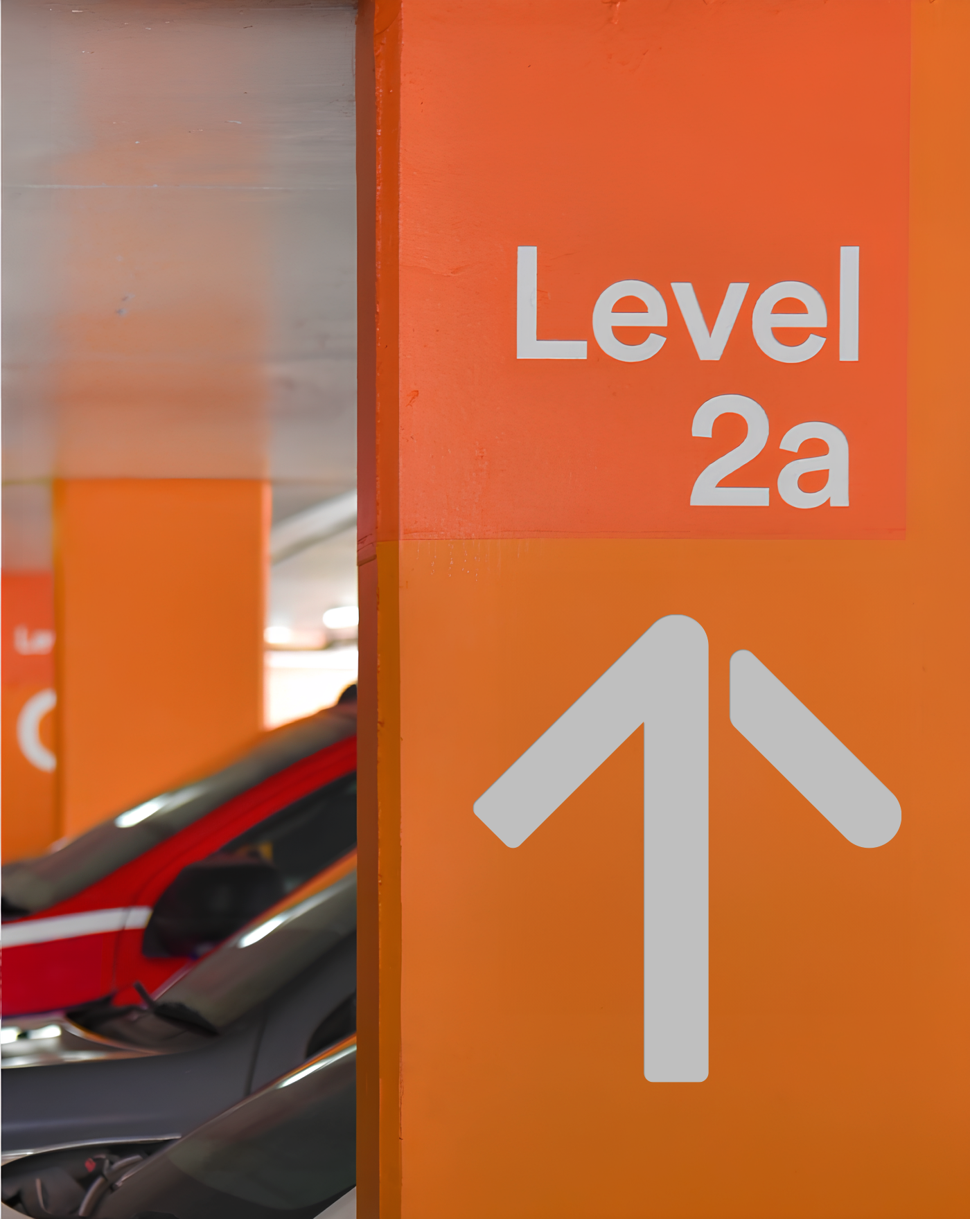
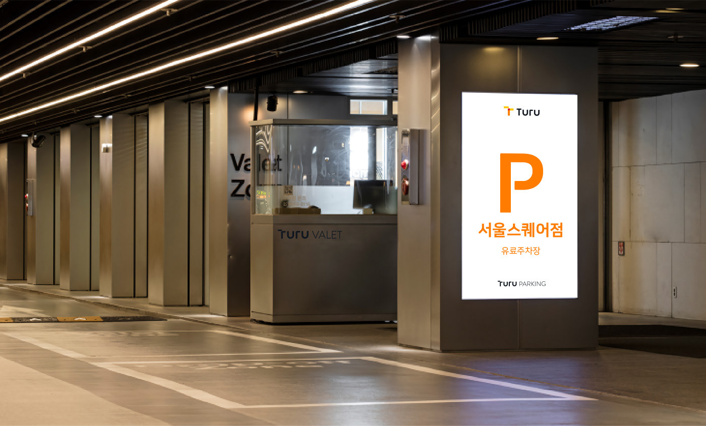
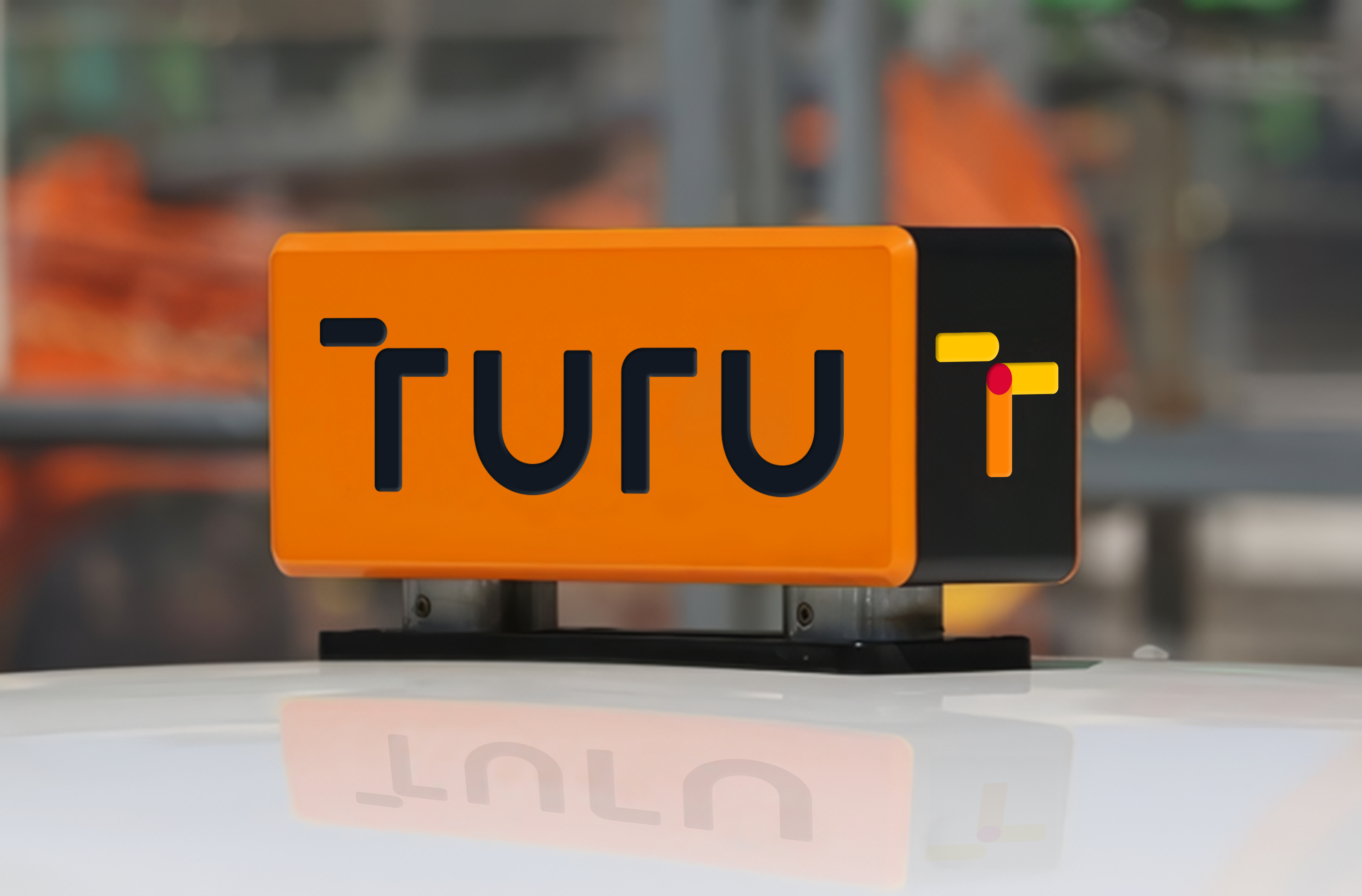
In addition to its applicability in mobile environments, we have established a design system that allows users to experience TURU's mobile services easily and conveniently through design that is conveniently observed in parking lots and electric charging environments.
Studio Tangible consistently applied cropping method and magnification across design items. In addition, the combination of area graphic elements and delicate line elements was used alone to increase the flexibility of the design that enables an adaptation to diverse applications.
In addition to its applicability in mobile environments, we have established a design system that allows users to experience TURU's mobile services easily and conveniently through design that is conveniently observed in parking lots and electric charging environments.
_
스튜디오 텐저블은 이동에 필요한 모든 연결을 지향하는 모빌리티 서비스 브랜드 TURU를 위한 Brand Identity를 개발했습니다. 도로 및 이동수단의 연결을 의미하는 Line, 생생한 모빌리티 경험을 상징하는 Dot, 그리고 통합 서비스 플랫폼을 나타내는 Line과 Dot이 결합된 형태라는 세가지 요소를 다양한 어플리케이션에서 효과적으로 풀어내고자 했습니다.
이를 위해 크롭과 확대를 디자인 항목 전반에 일관성있게 적용했습니다. 또한 면적인 그래픽 요소와 섬세한 선적 요소를 조합 및 단독 사용하여 다양한 변주가 가능하도록 디자인의 유연성을 높였습니다.
모바일 환경에서의 적용성 뿐만 아니라, 오프라인 주차 및 전기 충전 환경에서의 직관성을 높이는 디자인을 통해 사용자들이 보다 쉽고 편리하게 TURU만의 이동 서비스를 경험할 수 있는 디자인 시스템을 구축했습니다.
이를 위해 크롭과 확대를 디자인 항목 전반에 일관성있게 적용했습니다. 또한 면적인 그래픽 요소와 섬세한 선적 요소를 조합 및 단독 사용하여 다양한 변주가 가능하도록 디자인의 유연성을 높였습니다.
모바일 환경에서의 적용성 뿐만 아니라, 오프라인 주차 및 전기 충전 환경에서의 직관성을 높이는 디자인을 통해 사용자들이 보다 쉽고 편리하게 TURU만의 이동 서비스를 경험할 수 있는 디자인 시스템을 구축했습니다.