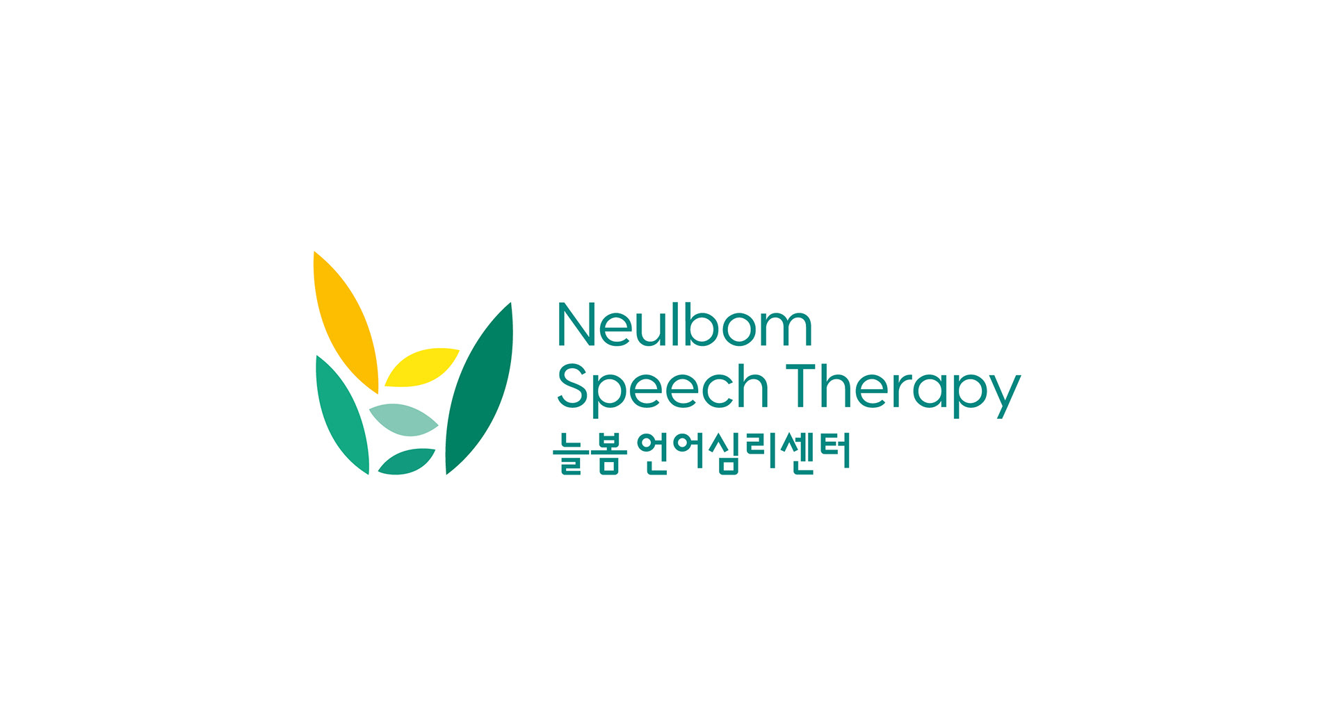
Neulbom Speech Therapy
Children's therapy center Branding
Children's therapy center Branding
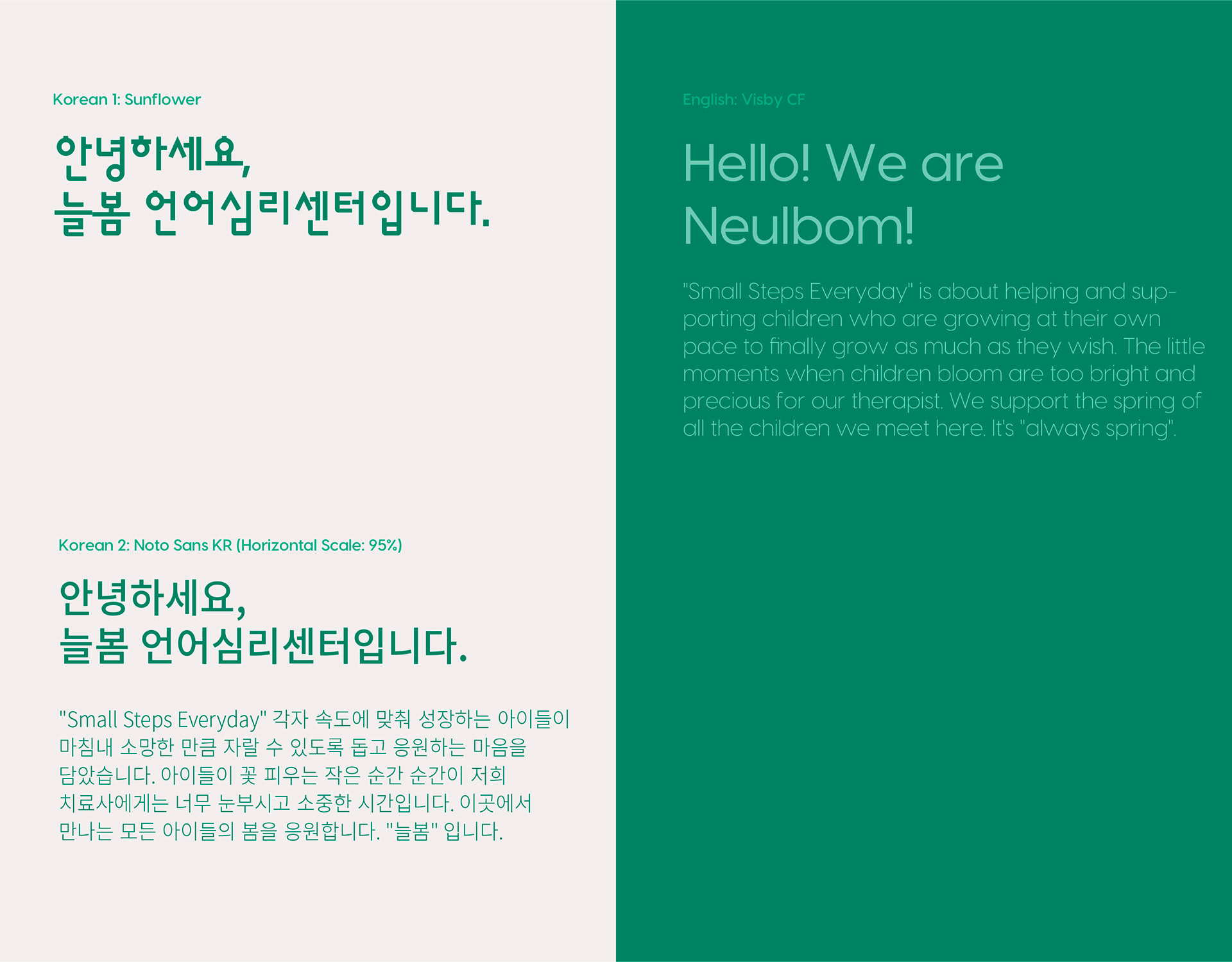
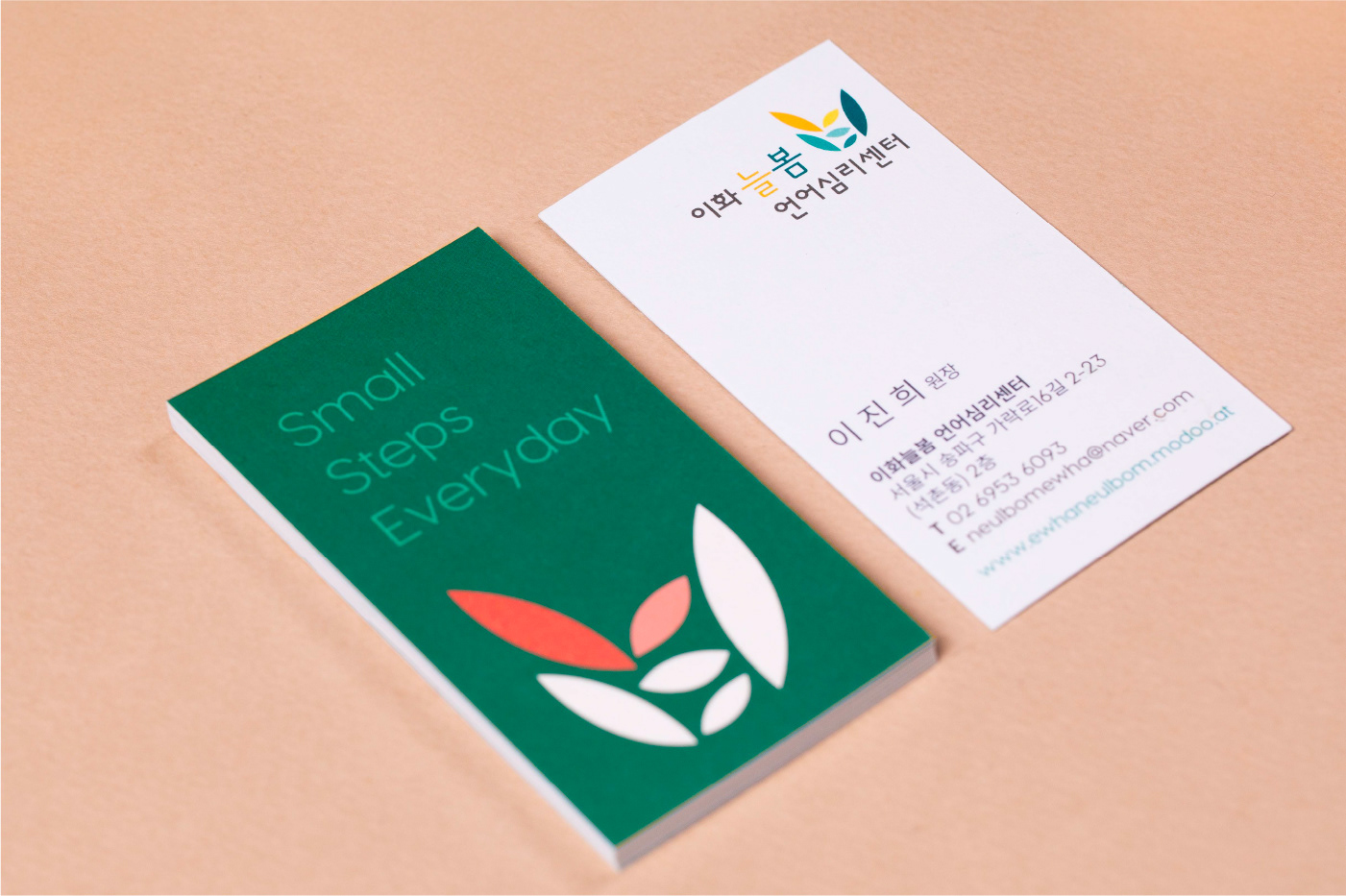
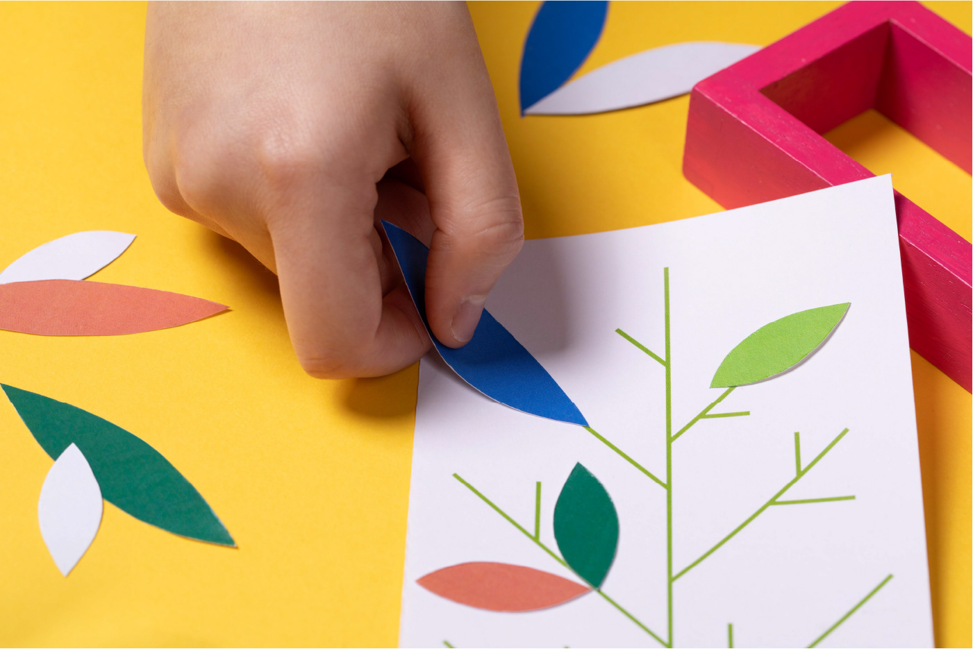
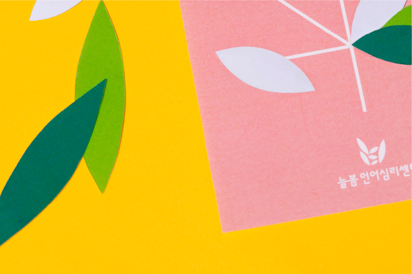
Studio tanGiBle has developed the brand identity for Neulbom, a therapy center for children with language development disorders. To emphasize the unique aspect of being a brand focused on language therapy, the identity visually represents linguistic elements.
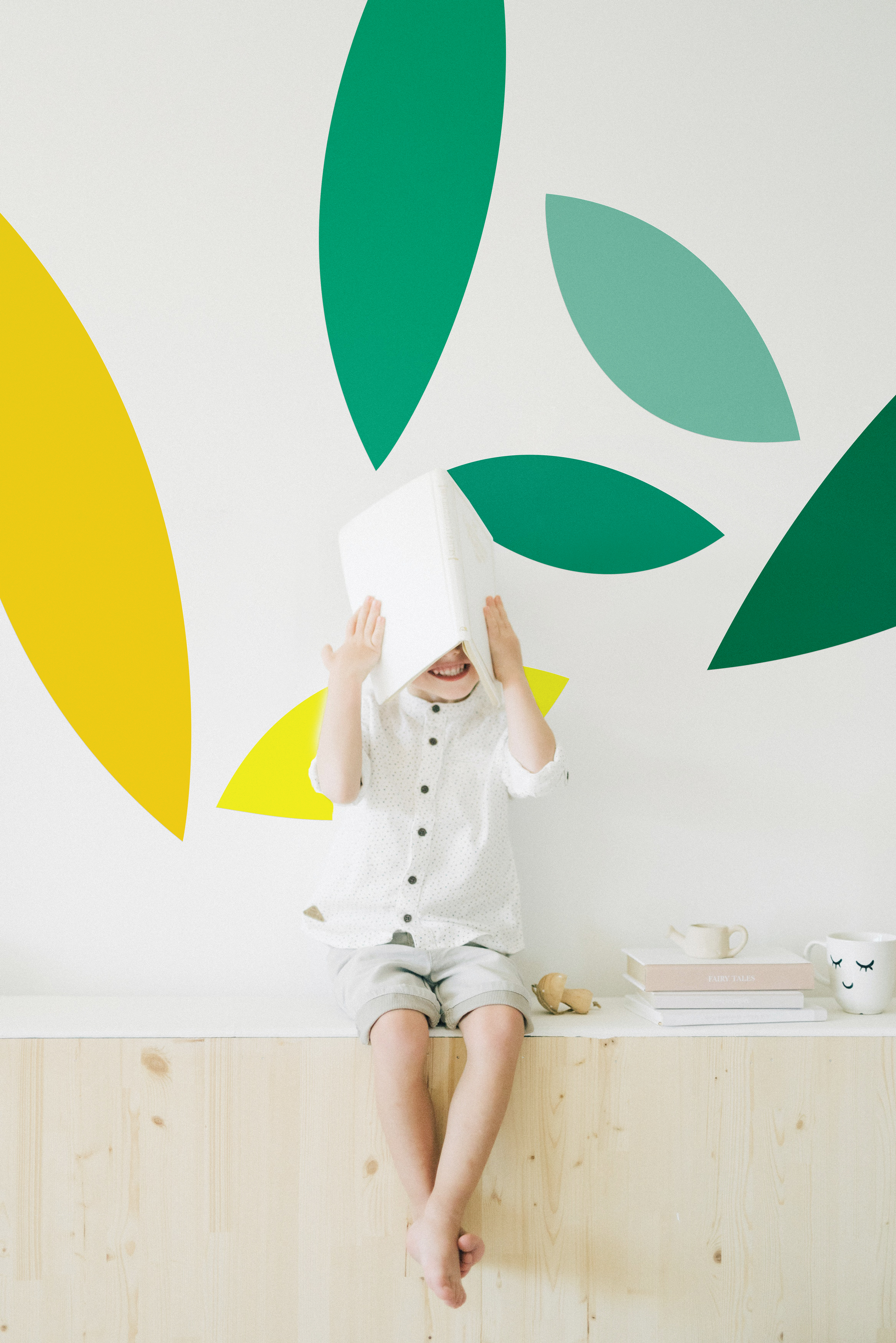
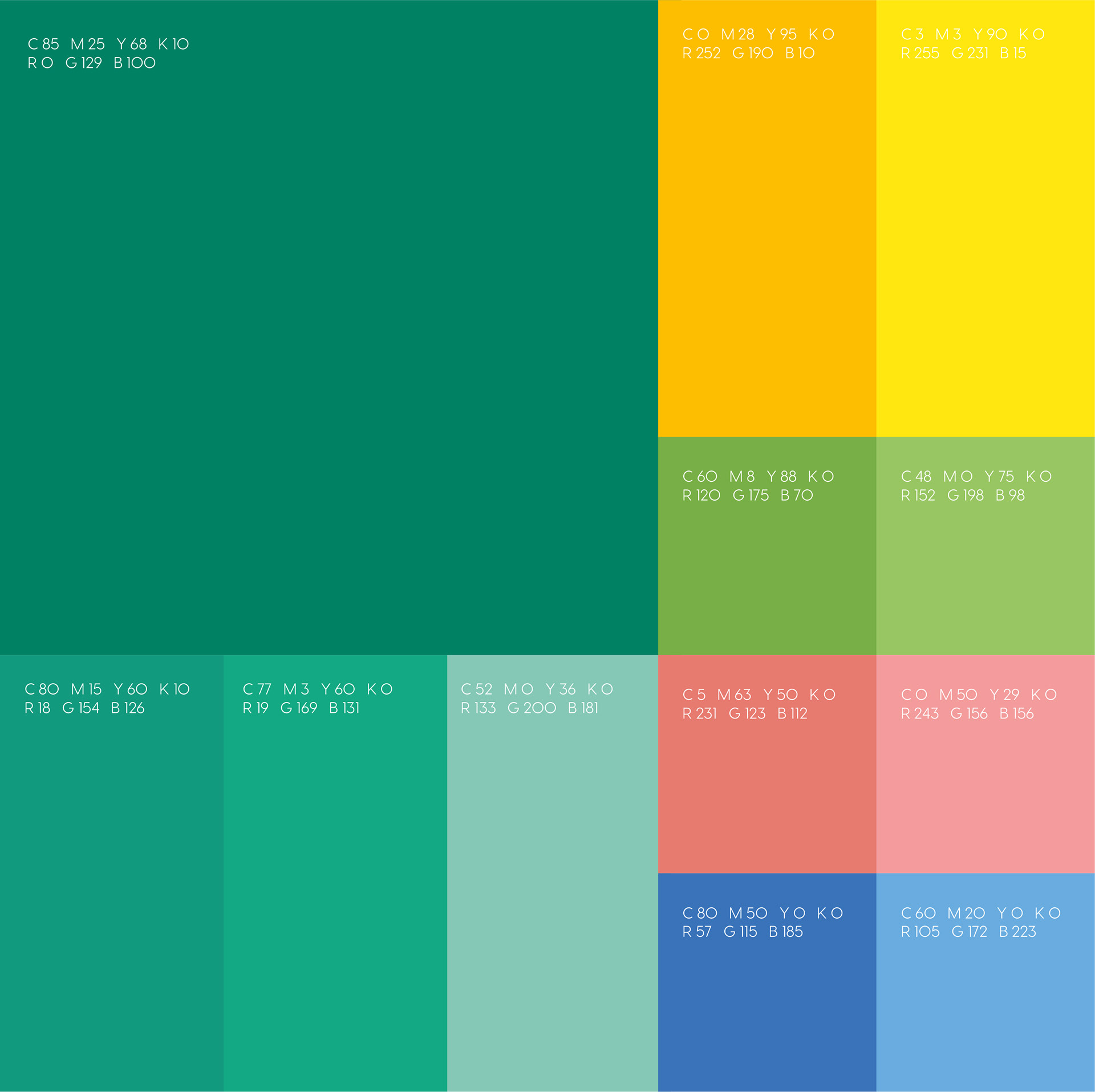
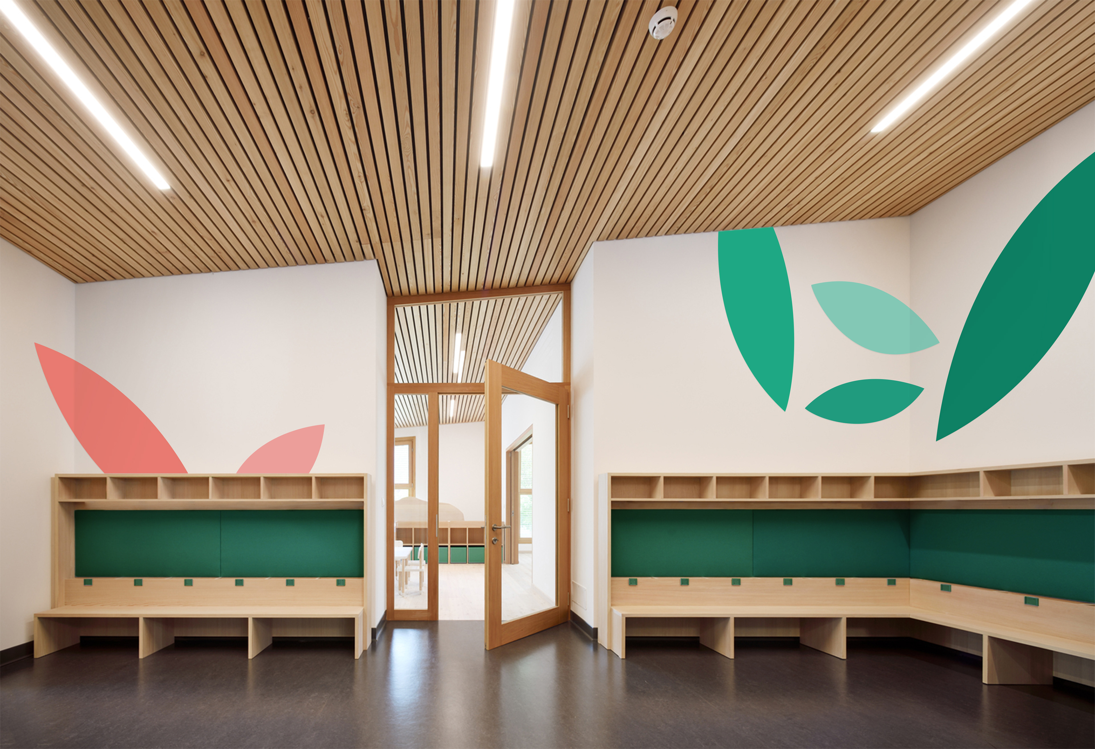
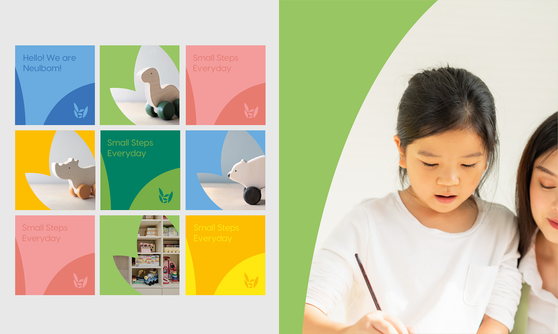
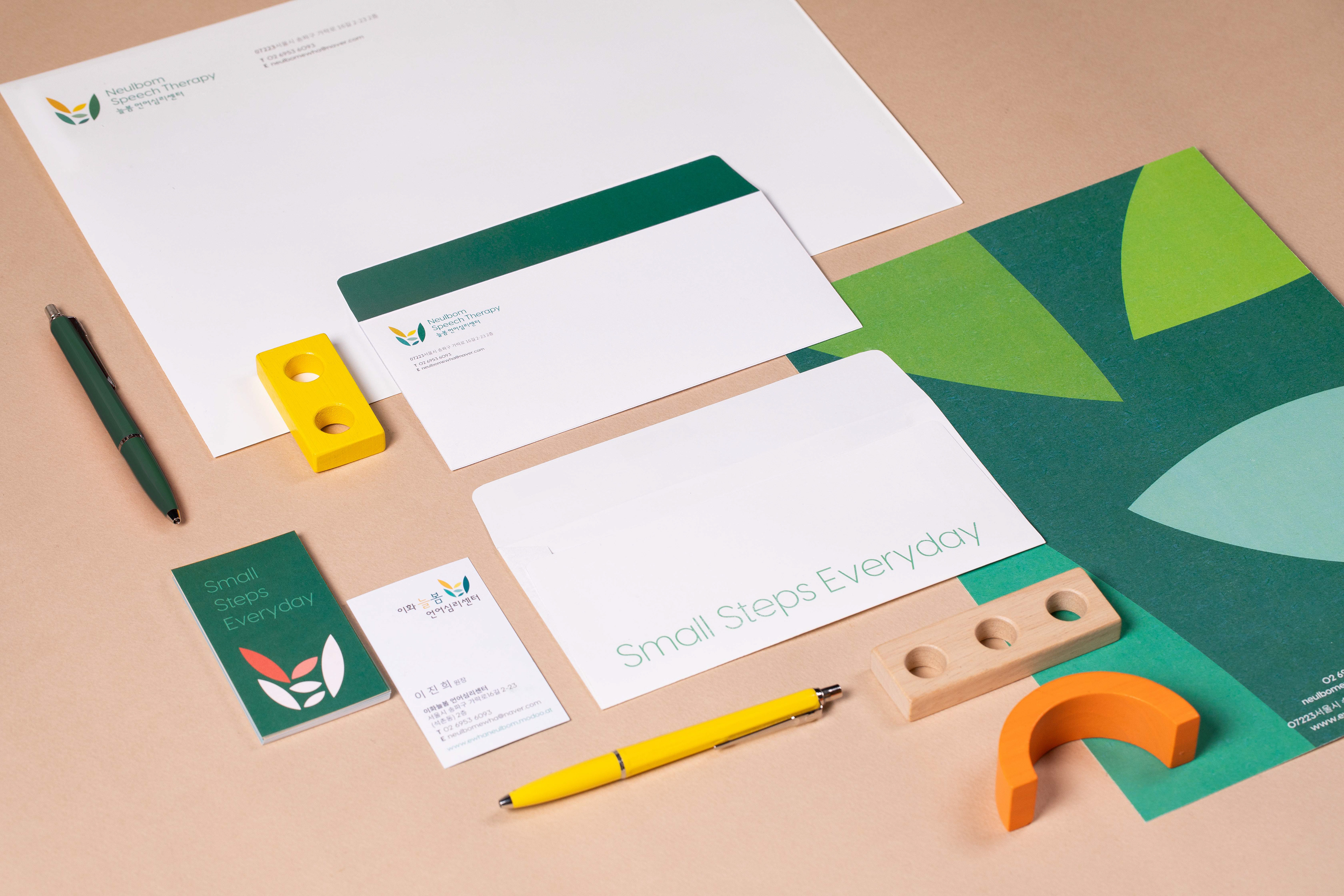
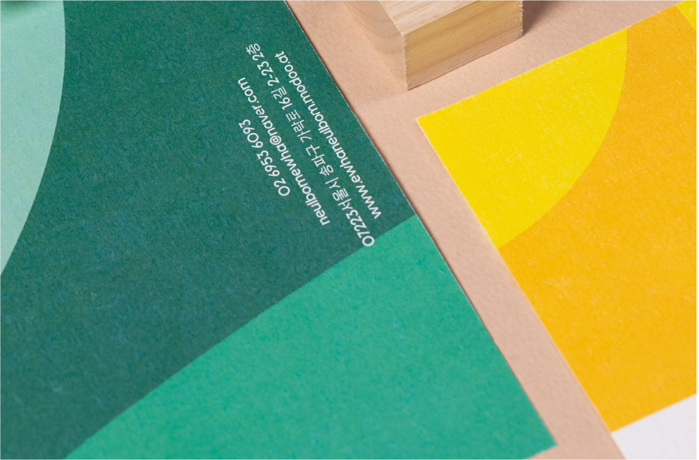
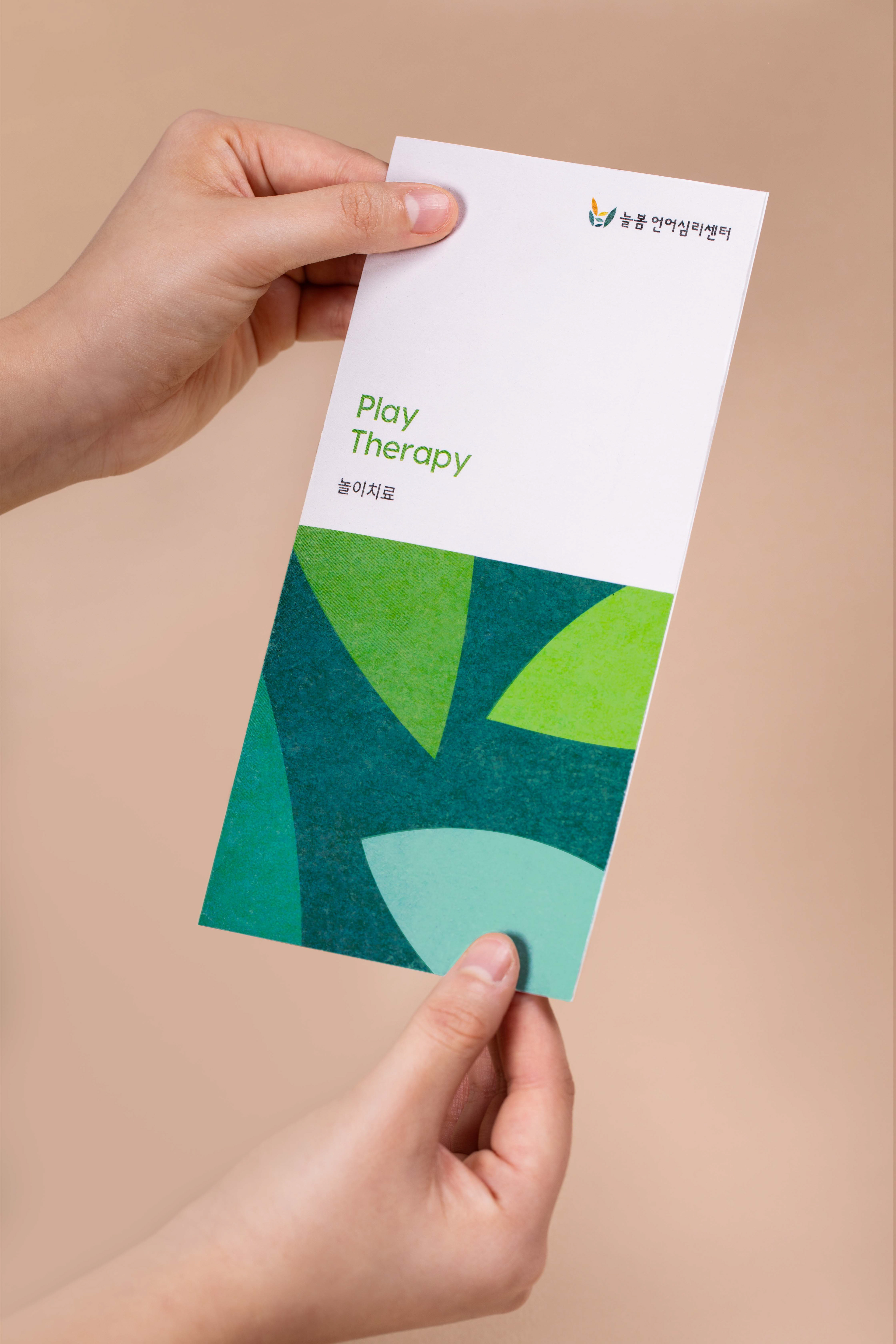
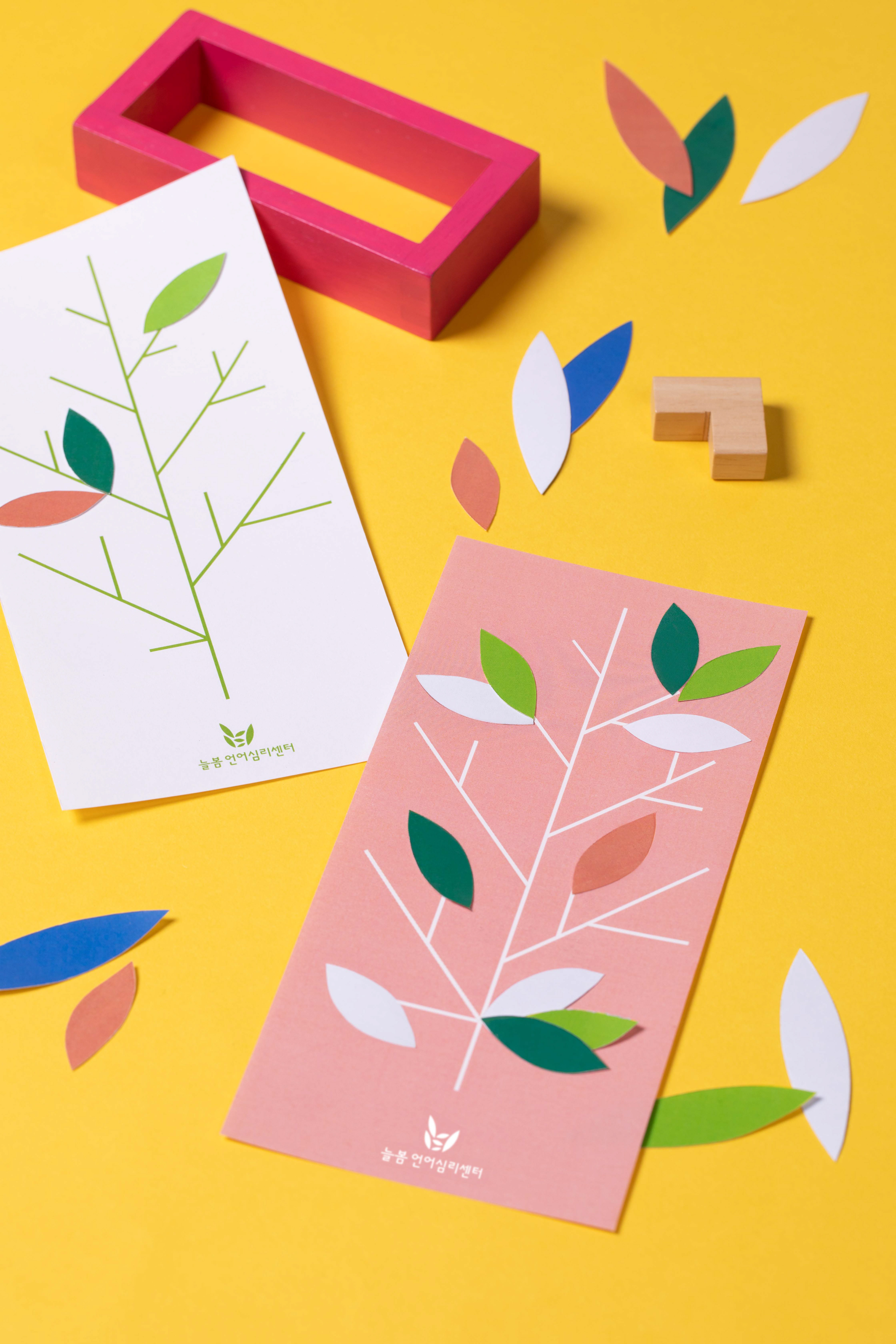
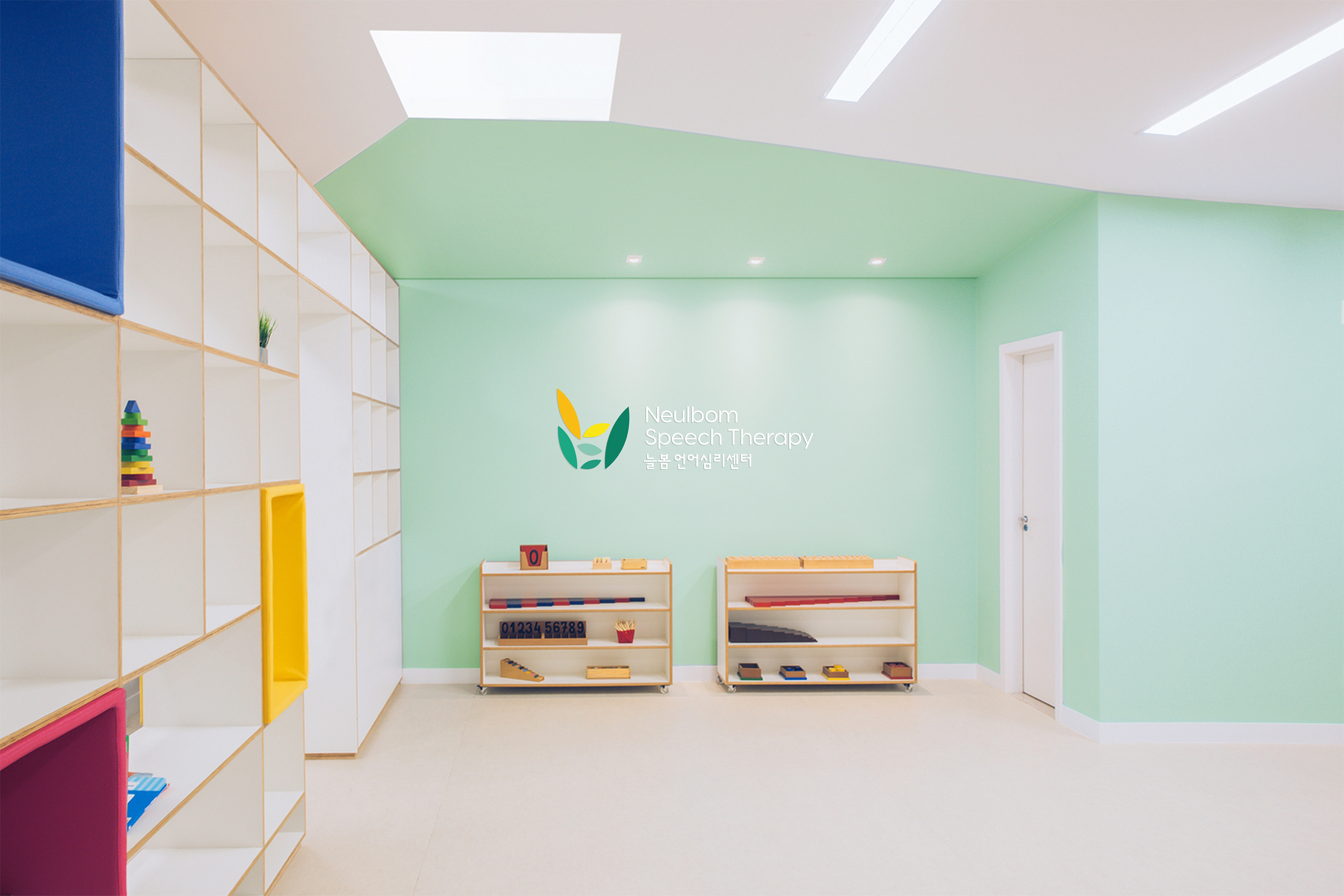
The initial consonants of the brand name, ㄴ (N) and ㅂ (B), are depicted as vibrant leaves blossoming in spring. The accumulating leaves symbolize the hope and fruition that children will achieve through the brand, akin to the announcement of spring. The brand palette is filled with colors associated with spring, with a friendly tone that appeals to children. Starting from the main color green, it transitions to soft colors such as yellow, pink, and blue. This soft color scheme plays a role in connecting with children on an emotional level, going beyond therapy to provide a sentimental brand experience.
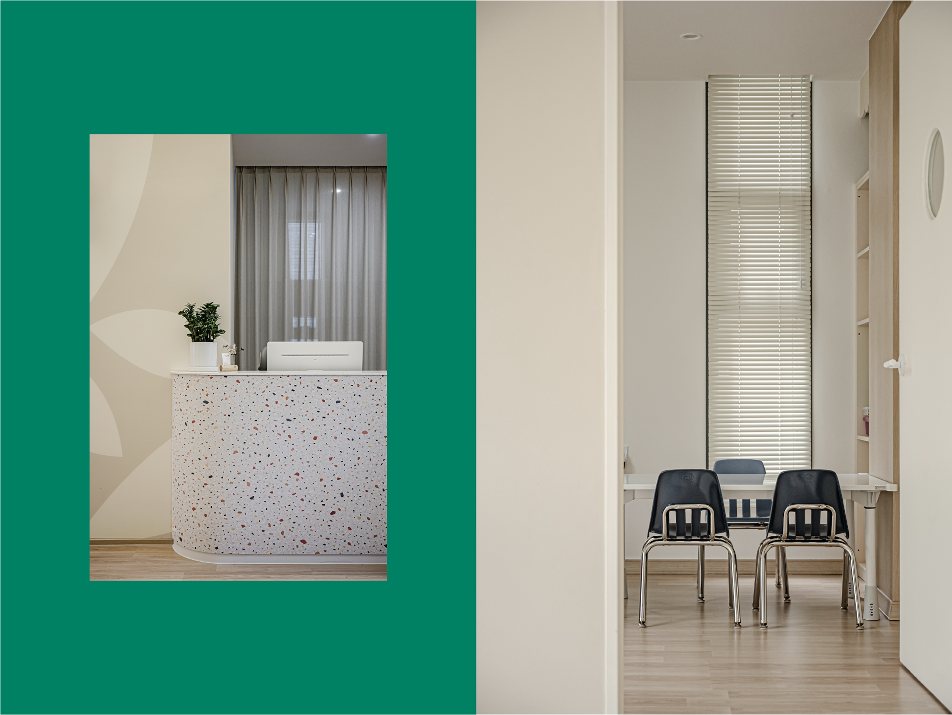
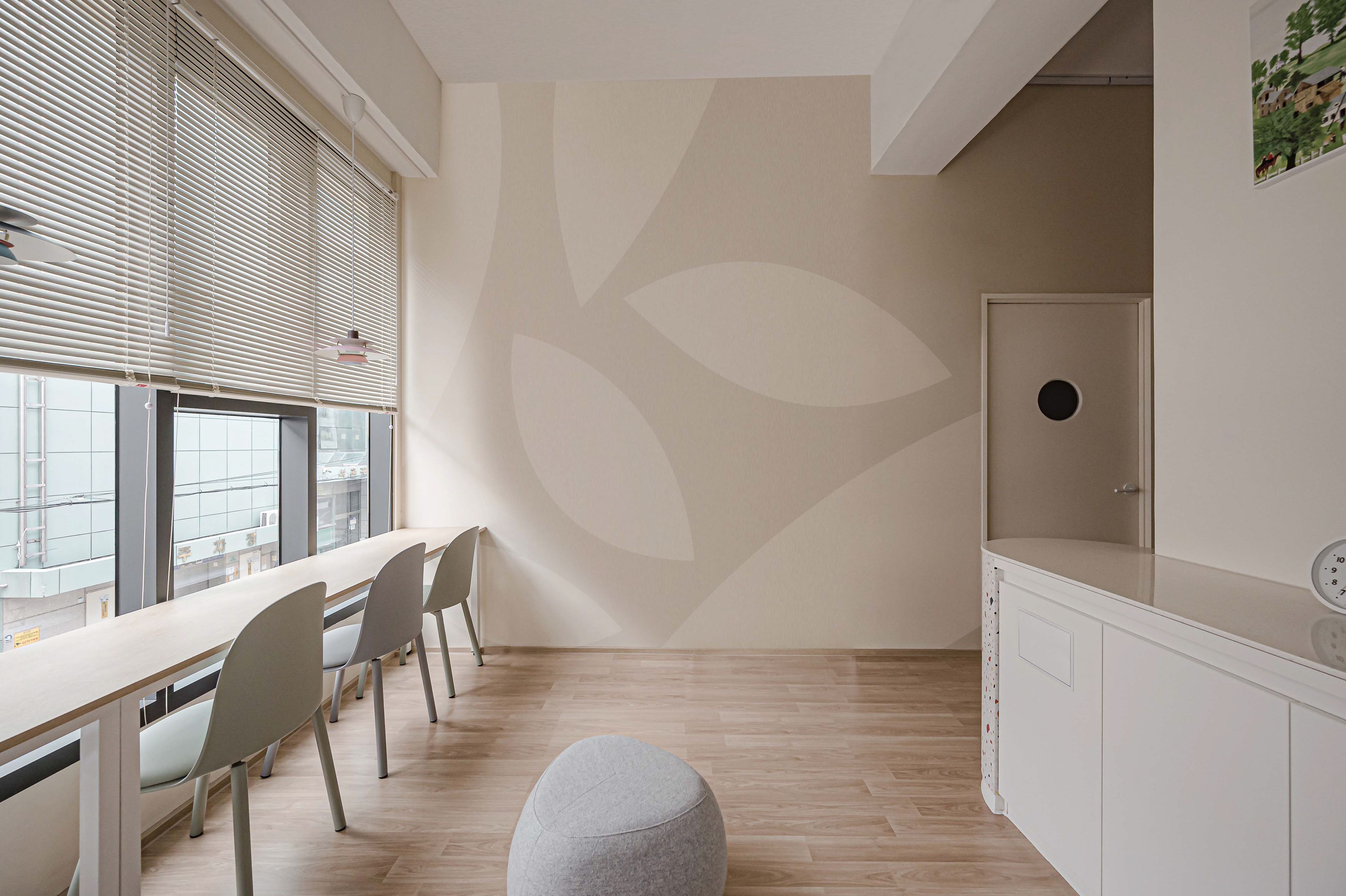
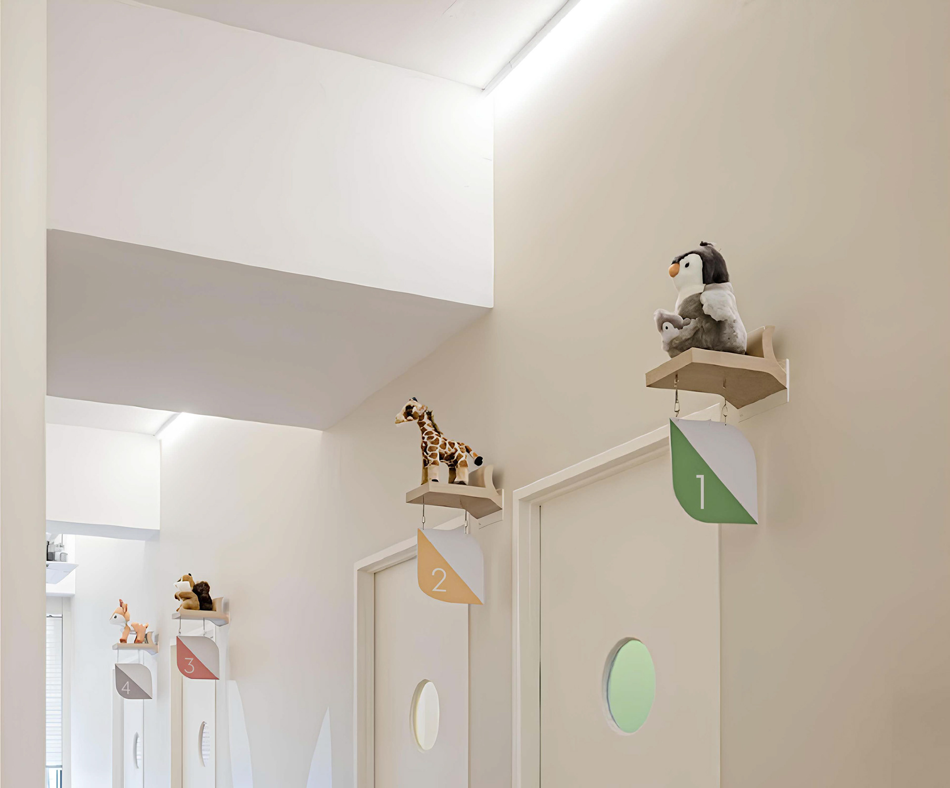
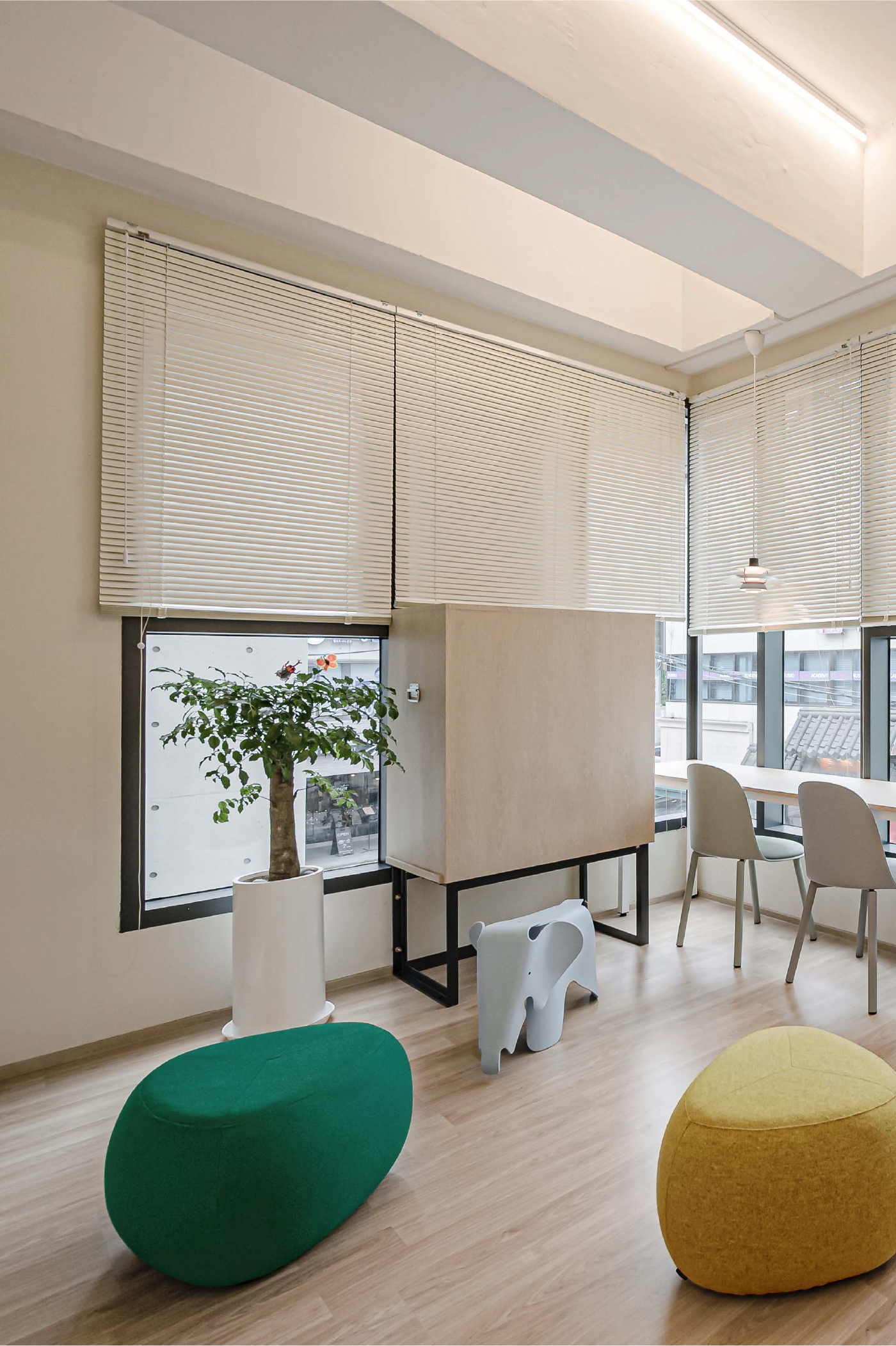
The consistent application of various leaf shapes and colors throughout Neulbom's space reflects the brand's vision for children's dreams and aspirations. May the brand blossom like leaves, fostering the dreams and hopes of the children Neulbom aims to serve.